Sticky bottom navbar using jquery
In our previous tutorial, we have seen How to Show Another big Image On Hover Using JQuery. In this tutorial, we are going to create a sticky navbar or we can say sticky footer at the bottom of the browser window while the page scroll.
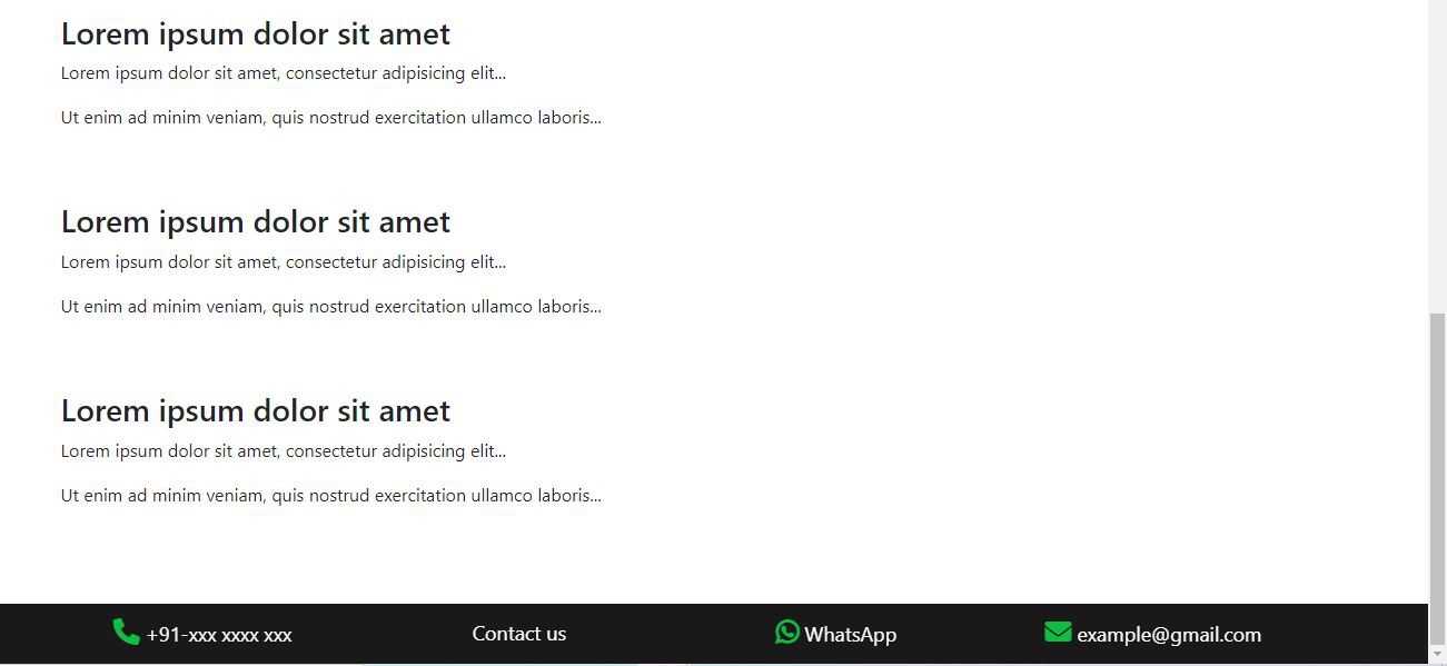
A sticky navbar or footer is a critical part of our website navigation, we can highlight essential links or CTA by sticking the navbar to the bottom of our browser window while the page scroll. in this tutorial, we will create this using jquery .scroll method.
Now, let's start doing this
Copy the below HTML and past it on your HTML page in separate section anywhere
        <link rel="stylesheet" href="https://cdn.jsdelivr.net/npm/[email protected]/dist/css/bootstrap.min.css">
<link rel="stylesheet" href="https://cdnjs.cloudflare.com/ajax/libs/font-awesome/6.1.1/css/all.min.css" />

<!-- jquery CDN  -->
https://code.jquery.com/jquery-3.6.0.min.js

<div class="sticky_section">
  <div class="container">

    <div class="row">

      <div class="col-lg-3">

        <div class="scroll-box">

          <p><a href="tel:xxx xxxx xxx"><i class="fa-regular fa-phone"></i> +91-xxx xxxx xxx</a></p>

        </div>

      </div>

      <div class="col-lg-3">

        <div class="scroll-box">

          <p><a href="#">Contact us</a></p>

        </div>

      </div>

      <div class="col-lg-3">

        <div class="scroll-box">

          <p><a href="https://api.whatsapp.com/send?phone=+918585858585">
              <i class="fa-brands fa-whatsapp"></i> WhatsApp </a>
          </p>

        </div>

      </div>

      <div class="col-lg-3">

        <div class="scroll-box">

          <p> <a href="mailto:[email protected]"><i class="fa-regular fa-envelope"></i> [email protected]</a> </p>

        </div>

      </div>

    </div>

  </div>

</div>
        /*sticky css*/

body {
  padding-bottom: 100px;
}

.sticky_section {
  background-color: rgba(0, 0, 0, 0.9);
  padding: 13px 0;
  z-index: 999;
  position: fixed;
  width: 100%;
  bottom: 0px;
  left: 0px;
  display: none;
}

.scroll-box p {
  color: #fff;
  font-size: 18px;
  margin-bottom: 0;
  text-align: center;
}

.scroll-box i {
  color: #0ebe44;
  font-size: 24px;
  font-weight: 600;
  margin: 0px 0 0 0;
}

.scroll-box p a {
  color: #fff;
  text-decoration: none;
}

.scroll-box p a:hover {
  color: #fff;
  text-decoration: none;
}
Finally, add the below jquery in your javascript file below the HTML page.
Make sure jquery only works with jquery CDN or jquery library. which I already provided above.
        $(window).on('scroll', function () {
  //check if page scroll up > 200px
  if ($(window).scrollTop() > 200) {
    $('.sticky_section').show();
  } else {
    $('.sticky_section').hide();
  }
});