Image hover effect using custom CSS
In our previous tutorial, we have seen Service displaying with icon hover effect In this tutorial, we are going to create more image hover effects in various types.
In this tutorial, we are creating all these effects in CSS by changing the hover property. we will see multiple most usable CSS hover effects.
For example:
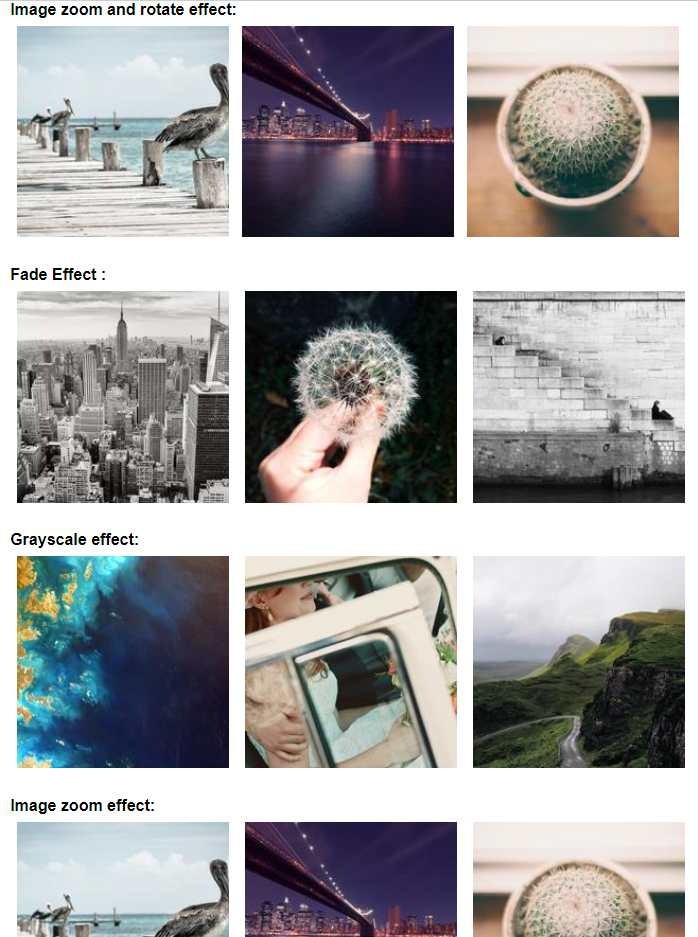
- Image zoom and rotate effect
- Image fade Effect
- Grayscale effect
- Image zoom effect
Let's start creating an HTML page and paste the below code.
        <section>
    <div class="c_container hover_04">
        <h2>Image zoom and rotate effect:</h2>
        <div class="img_outer">
            <img class="fadding-photo" src="https://picsum.photos/id/244/200/200" />
        </div>
        <div class="img_outer">
            <img class="fadding-photo" src="https://picsum.photos/id/249/200/200" />
        </div>
        <div class="img_outer">
            <img class="fadding-photo" src="https://picsum.photos/id/248/200/200" />
        </div>


    </div>
</section>

<section>


    <div class="c_container hover_01">
        <h2>Fade Effect :</h2>
        <img class="thumb_photo" src="https://picsum.photos/id/238/200/200" />
        <img class="thumb_photo" src="https://picsum.photos/id/239/200/200" />
        <img class="thumb_photo" src="https://picsum.photos/id/240/200/200" />
    </div>

</section>

<section>
    <div class="c_container hover_02">
        <h2>Grayscale effect:</h2>
        <img class="thumb_photo" src="https://picsum.photos/id/1002/200/200" />
        <img class="thumb_photo" src="https://picsum.photos/id/1013/200/200" />
        <img class="thumb_photo" src="https://picsum.photos/id/1018/200/200" />
    </div>

</section>
<section>
    <div class="c_container hover_03">
        <h2>Image zoom effect:</h2>
        <img class="thumb_photo" src="https://picsum.photos/id/244/200/200" />
        <img class="thumb_photo" src="https://picsum.photos/id/249/200/200" />
        <img class="thumb_photo" src="https://picsum.photos/id/248/200/200" />
    </div>

</section>
Now we will use our custom CSS on the above page.
        * {
    margin: 0px;
    padding: 0px;
    font-family: sans-serif;
}

section {
    width: 100%;
    display: flex;
    justify-content: center;
    margin-top: 30px;
}

section .c_container {
    width: 100%;
    max-width: 1024px;
}

section .c_container img {
    transition: all .3s;
}

section .c_container .thumb_photo {
    width: 31%;
    max-width: 100%;
    padding: 1%;
}

section .c_container .img_outer {
    width: 31%;
    max-width: 100%;
    padding: 1%;
    float: left;
    overflow: hidden;

}

section .c_container .img_outer img {
    width: 100%;
}

section .c_container .img_outer {
    width: 31%;
    max-width: 100%;
    padding: 1%;
    transition: all .3s;
    float: left;
}

section .hover_01 img:hover {
    opacity: 0.4;
}

section .hover_02 img:hover {
    -webkit-filter: grayscale(100%);
    /* Safari 6.0 - 9.0 */
    filter: grayscale(100%);
}

section .hover_03 img:hover {
    transform: scale(1.1);
}

section .hover_04 img:hover {
    transform: scale(1.3) rotate(10deg);
}