Creating Tabs design with Bootstrap 5
Bootstrap tab provides an easy and powerful mechanism to handle a large amount of content within a small area by separating content into different panes where each pane is viewable one at a time.
It's most important concept is that user can access multiple contents by clicking the buttons without refreshing the page so its load faster than page load.
In this article, we will learn how to create dynamic tabs to toggle between the content using the Bootstrap 5 library. and furthermore we will discuss bootstrap 5 javascript enable
So, let's create an HTML structure off all three design
<link
rel="stylesheet"
href="https://cdnjs.cloudflare.com/ajax/libs/font-awesome/5.15.4/css/all.min.css"
integrity="sha512-1ycn6IcaQQ40/MKBW2W4Rhis/DbILU74C1vSrLJxCq57o941Ym01SwNsOMqvEBFlcgUa6xLiPY/NS5R+E6ztJQ=="
crossorigin="anonymous"
referrerpolicy="no-referrer"
/>
<!-- Bootstrap CSS -->
<link href="https://cdn.jsdelivr.net/npm/[email protected]/dist/css/bootstrap.min.css" rel="stylesheet" integrity="sha384-KyZXEAg3QhqLMpG8r+8fhAXLRk2vvoC2f3B09zVXn8CA5QIVfZOJ3BCsw2P0p/We" crossorigin="anonymous" />
<script src="https://cdn.jsdelivr.net/npm/[email protected]/dist/js/bootstrap.bundle.min.js" integrity="sha384-U1DAWAznBHeqEIlVSCgzq+c9gqGAJn5c/t99JyeKa9xxaYpSvHU5awsuZVVFIhvj" crossorigin="anonymous">
<div class="container py-5 custom_tab_style1_outer">
<div class="row">
<div class="col-md-12 text-left">
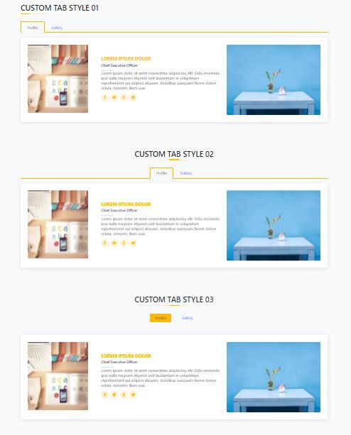
<h2 class="main_title main_title_left">Custom tab style 01</h2>
</div>
<div class="col-md-12">
<ul class="nav nav-tabs custom_tab_style1" id="myTab" role="tablist">
<li class="nav-item" role="presentation">
<button class="nav-link active" id="home-tab" data-bs-toggle="tab" data-bs-target="#Profile" type="button" role="tab" aria-controls="home" aria-selected="true">Profile</button>
</li>
<li class="nav-item" role="presentation">
<button class="nav-link" id="profile-tab" data-bs-toggle="tab" data-bs-target="#Gallery" type="button" role="tab" aria-controls="profile" aria-selected="false">Gallery</button>
</li>
</ul>
<div class="tab-content" id="myTabContent">
<div class="tab-pane fade show active" id="Profile" role="tabpanel" aria-labelledby="home-tab">
<div class="member_card_style">
<div class="row">
<div class="col-md-8">
<div class="row">
<div class="col-md-4 left_img">
<img class="img-fluid" src="https://picsum.photos/id/20/400/450" alt="" />
</div>
<div class="col-md-8 d-flex align-items-center">
<div class="member-info">
<h4>Lorem ipsum dolor</h4>
<span>Chief Executive Officer</span>
<p>
Lorem ipsum dolor sit amet consectetur adipisicing elit. Odio reiciendis ipsa nulla magnam eligendi odit laudantium in voluptatum reprehenderit qui adipisci aliquam, doloribus quisquam facere dolore soluta, dolorem,
illum quis.
</p>
<div class="social">
<a href=""><i class="fab fa-facebook-f"></i></a>
<a href=""><i class="fab fa-twitter"></i></a>
<a href=""><i class="fab fa-facebook-f"></i></a>
<a href=""> <i class="fab fa-twitter"></i> </a>
</div>
</div>
</div>
</div>
</div>
<div class="col-md-4"><img class="img-fluid" src="https://picsum.photos/id/1068/400/300" alt="" /></div>
</div>
</div>
</div>
<div class="tab-pane fade" id="Gallery" role="tabpanel" aria-labelledby="profile-tab">
<p>Lorem, ipsum dolor sit amet consectetur adipisicing elit. Labore ab obcaecati ullam laboriosam distinctio tenetur, rerum quas cumque fugit enim quidem nesciunt voluptatibus quod placeat. Saepe est fuga et quis.</p>
</div>
</div>
</div>
</div>
</div>
<div class="container py-5 custom_tab_style1_outer">
<div class="row">
<div class="col-md-12 text-center">
<h2 class="main_title">Custom tab style 02</h2>
</div>
<div class="col-md-12">
<ul class="nav nav-tabs custom_tab_style2" id="myTab" role="tablist">
<li class="nav-item" role="presentation">
<button class="nav-link active" id="home-tab" data-bs-toggle="tab" data-bs-target="#Profile2" type="button" role="tab" aria-controls="home" aria-selected="true">Profile</button>
</li>
<li class="nav-item" role="presentation">
<button class="nav-link" id="profile-tab" data-bs-toggle="tab" data-bs-target="#Gallery2" type="button" role="tab" aria-controls="profile" aria-selected="false">Gallery</button>
</li>
</ul>
<div class="tab-content" id="myTabContent">
<div class="tab-pane fade show active" id="Profile2" role="tabpanel" aria-labelledby="home-tab">
<div class="member_card_style">
<div class="row">
<div class="col-md-8">
<div class="row">
<div class="col-md-4 left_img">
<img class="img-fluid" src="https://picsum.photos/id/20/400/450" alt="" />
</div>
<div class="col-md-8 d-flex align-items-center">
<div class="member-info">
<h4>Lorem ipsum dolor</h4>
<span>Chief Executive Officer</span>
<p>
Lorem ipsum dolor sit amet consectetur adipisicing elit. Odio reiciendis ipsa nulla magnam eligendi odit laudantium in voluptatum reprehenderit qui adipisci aliquam, doloribus quisquam facere dolore soluta, dolorem,
illum quis.
</p>
<div class="social">
<a href=""><i class="fab fa-facebook-f"></i></a>
<a href=""><i class="fab fa-twitter"></i></a>
<a href=""><i class="fab fa-facebook-f"></i></a>
<a href=""> <i class="fab fa-twitter"></i> </a>
</div>
</div>
</div>
</div>
</div>
<div class="col-md-4"><img class="img-fluid" src="https://picsum.photos/id/1068/400/300" alt="" /></div>
</div>
</div>
</div>
<div class="tab-pane fade" id="Gallery2" role="tabpanel" aria-labelledby="profile-tab">
<p>
Lorem, ipsum, dolor sit amet consectetur adipisicing elit. Repellat eum, obcaecati quia dignissimos culpa quod, est provident fuga iure. Molestiae eligendi voluptates corrupti cum, esse, est reiciendis itaque accusamus.
Praesentium?q
</p>
</div>
</div>
</div>
</div>
</div>
<div class="container py-5 custom_tab_style1_outer">
<div class="row">
<div class="col-md-12 text-center">
<h2 class="main_title">Custom tab style 03</h2>
</div>
<div class="col-md-12">
<ul class="nav nav-tabs custom_tab_style3" id="myTab" role="tablist">
<li class="nav-item" role="presentation">
<button class="nav-link active" id="home-tab" data-bs-toggle="tab" data-bs-target="#Profile3" type="button" role="tab" aria-controls="home" aria-selected="true">Profile</button>
</li>
<li class="nav-item" role="presentation">
<button class="nav-link" id="profile-tab" data-bs-toggle="tab" data-bs-target="#Gallery3" type="button" role="tab" aria-controls="profile" aria-selected="false">Gallery</button>
</li>
</ul>
<div class="tab-content" id="myTabContent">
<div class="tab-pane fade show active" id="Profile3" role="tabpanel" aria-labelledby="home-tab">
<div class="member_card_style">
<div class="row">
<div class="col-md-8">
<div class="row">
<div class="col-md-4 left_img">
<img class="img-fluid" src="https://picsum.photos/id/20/400/450" alt="" />
</div>
<div class="col-md-8 d-flex align-items-center">
<div class="member-info">
<h4>Lorem ipsum dolor</h4>
<span>Chief Executive Officer</span>
<p>
Lorem ipsum dolor sit amet consectetur adipisicing elit. Odio reiciendis ipsa nulla magnam eligendi odit laudantium in voluptatum reprehenderit qui adipisci aliquam, doloribus quisquam facere dolore soluta, dolorem,
illum quis.
</p>
<div class="social">
<a href=""><i class="fab fa-facebook-f"></i></a>
<a href=""><i class="fab fa-twitter"></i></a>
<a href=""><i class="fab fa-facebook-f"></i></a>
<a href=""> <i class="fab fa-twitter"></i> </a>
</div>
</div>
</div>
</div>
</div>
<div class="col-md-4"><img class="img-fluid" src="https://picsum.photos/id/1068/400/300" alt="" /></div>
</div>
</div>
</div>
<div class="tab-pane fade" id="Gallery3" role="tabpanel" aria-labelledby="profile-tab">
<p>
Lorem, ipsum, dolor sit amet consectetur adipisicing elit. Repellat eum, obcaecati quia dignissimos culpa quod, est provident fuga iure. Molestiae eligendi voluptates corrupti cum, esse, est reiciendis itaque accusamus.
Praesentium?q
</p>
</div>
</div>
</div>
</div>
</div>
        /*common styling*/
.main_title {
  position: relative;
  margin-bottom: 40px !important;
  text-transform: uppercase;
}

.main_title:before {
  content: "";
  position: absolute;
  display: block;
  width: 120px;
  height: 2px;
  background: #ffecbb;
  bottom: -8px;
  left: calc(50% - 60px);
}
.main_title:after {
  content: "";
  position: absolute;
  display: block;
  width: 40px;
  height: 4px;
  background: #fcc101;
  bottom: -9px;
  left: calc(50% - 20px);
}

.main_title_left:before,
.main_title_left:after {
  left: 0px;
}

/*common styling end*/
.member_card_style {
  position: relative;
  box-shadow: 0px 2px 15px rgba(0, 0, 0, 0.1);
  padding: 30px;
  border-radius: 5px;
  background: #fff;
  transition: 0.5s;
  margin: 20px 0;
}

.member_card_style img {
  border-radius: 5px;
  transition: all 0.3s;
}

.member_card_style:hover {
  transform: translateY(-10px);
}

.member-info {
  padding-left: 30px;
  display: inline-block;
}

.member-info h4 {
  font-weight: 700;
  margin-bottom: 5px;
  font-size: 20px;
  color: #fcc101;
  text-transform: uppercase;
}

.member-info .social {
  margin-top: 12px;
  display: flex;
  align-items: center;
  justify-content: flex-start;
}

.member-info .social a {
  transition: ease-in-out 0.3s;
  display: flex;
  align-items: center;
  justify-content: center;
  border-radius: 50px;
  width: 32px;
  height: 32px;
  background: #fff3d5;
  color: #ffb700;
  text-decoration: none;
}

.member-info .social a i {
  font-size: 16px;
  margin: 0 2px;
}

.member-info .social a:hover {
  background: #ffb700;
  color: #fff;
}

.member-info .social a + a {
  margin-left: 8px;
}

.member-info span {
  display: block;
  font-size: 15px;
  padding-bottom: 10px;
  position: relative;
  font-weight: 500;
}

.member-info span::after {
  content: "";
  position: absolute;
  display: block;
  width: 50px;
  height: 1px;
  background: #bfe0fd;
  bottom: 0;
  left: 0;
}

/*custom tab style 1*/
.custom_tab_style1.nav-tabs {
  border-bottom: 2px solid #ffb700;
}

.custom_tab_style1.nav-tabs .nav-link {
  margin-bottom: -2px;
  padding: 10px 25px;
  border-width: 2px;
}

.custom_tab_style1 .nav-item.show .nav-link,
.custom_tab_style1 .nav-link.active {
  color: #495057;
  background-color: #f8f9fa;
  border-width: 2px;
  border-color: #ffb700 #ffb700 #f8f9fa;
}

.custom_tab_style1 .nav-link:focus,
.custom_tab_style1 .nav-link:hover {
  border-width: 2px;
  border-color: #ffb700 #ffb700 #f8f9fa;
}

/*custom tab style 2*/
.custom_tab_style2.nav-tabs {
  border-bottom: 2px solid #ffb700;
  display: flex;
  justify-content: center;
}

.custom_tab_style2.nav-tabs .nav-link {
  margin-bottom: -2px;
  padding: 10px 25px;
  border-width: 2px;
}

.custom_tab_style2 .nav-item.show .nav-link,
.custom_tab_style2 .nav-link.active {
  color: #495057;
  background-color: #f8f9fa;
  border-width: 2px;
  border-color: #ffb700 #ffb700 #f8f9fa;
}

.custom_tab_style2 .nav-link:focus,
.custom_tab_style2 .nav-link:hover {
  border-width: 2px;
  border-color: #ffb700 #ffb700 #f8f9fa;
}

/*custom tab style 3*/
.custom_tab_style3.nav-tabs {
  border-bottom: 1px solid transparent;
  display: flex;
  justify-content: center;
  margin-bottom: 50px;
}

.custom_tab_style3.nav-tabs .nav-link {
  padding: 5px 20px;
  margin: 0 10px;
  border-radius: 0.25rem;
}

.custom_tab_style3 .nav-item.show .nav-link,
.custom_tab_style3 .nav-link.active {
  color: #495057;
  background-color: #ffb700;
  border-color: transparent;
}

.custom_tab_style3 .nav-link:focus,
.custom_tab_style3 .nav-link:hover {
  background-color: #ffb700;
  border-color: transparent;
  color: #fff;
}
Now design is ready to use,
Now we will learn how to javascript enable in bootstrap 5 as we now in bootstrap 5 mostly usable function is
$("#mytab").show But now in Bootstrap 5 jquery is fully removed so we need some javascript functions to be enabled that, and each tab needs to be activated individually
Events (from Bootstrap 5 official)
Let's see the bootstrap 5 events list, When showing a new tab, the events fire in the following order:
- hide.bs.tab (on the current active tab)
- show.bs.tab (on the to-be-shown tab)
- hidden.bs.tab (on the previous active tab, the same one as for the hide.bs.tab event)
- shown.bs.tab (on the newly-active just-shown tab, the same one as for the show.bs.tab event)
If no tab was already active, then the hide.bs.tab and hidden.bs.tab events will not be fired.
| Event type | Description |
|---|---|
show.bs.tab |
This event fires on tab show, but before the new tab has been shown. Use event.target and event.relatedTarget to target the active tab and the previous active tab (if available) respectively. |
shown.bs.tab |
This event fires on tab show after a tab has been shown. Use event.target and event.relatedTarget to target the active tab and the previous active tab (if available) respectively. |
hide.bs.tab |
This event fires when a new tab is to be shown (and thus the previous active tab is to be hidden). Use event.target and event.relatedTarget to target the current active tab and the new soon-to-be-active tab, respectively. |
hidden.bs.tab |
This event fires after a new tab is shown (and thus the previous active tab is hidden). Use event.target and event.relatedTarget to target the previous active tab and the new active tab, respectively. |
        var tabEl = document.querySelector('button[data-bs-toggle="tab"]')
tabEl.addEventListener('shown.bs.tab', function (event) {
  event.target // newly activated tab
  event.relatedTarget // previous active tab
})