how to make bootstrap modal draggable and resizable
Here is the perfect solution to make bootstrap modal draggable and resizable by using jquery UI. In this tutorial, we will discuss step by step and then we will also modify the modal design and will try to make our modal like WordPress bakery editor.
I hope at the end of this tutorial it will be very easy to implement a draggable and resizable modal using jquery UI and a little bit of tricky code.
So let's start, Prepare the HTML page with jquery, jquery UI, and bootstrap CDN or downloadable file in this tutorial I will use CDN
<!-- font awesome -->
<link rel="stylesheet" href="https://use.fontawesome.com/releases/v5.7.2/css/all.css" integrity="sha384-fnmOCqbTlWIlj8LyTjo7mOUStjsKC4pOpQbqyi7RrhN7udi9RwhKkMHpvLbHG9Sr" crossorigin="anonymous" />
<!-- Bootstrap 4 -->
<link rel="stylesheet" href="https://cdn.jsdelivr.net/npm/[email protected]/dist/css/bootstrap.min.css" integrity="sha384-B0vP5xmATw1+K9KRQjQERJvTumQW0nPEzvF6L/Z6nronJ3oUOFUFpCjEUQouq2+l" crossorigin="anonymous" />
<!--script-->
https://code.jquery.com/jquery-3.3.1.min.js
https://code.jquery.com/ui/1.12.0/jquery-ui.min.js
https://cdnjs.cloudflare.com/ajax/libs/popper.js/1.14.6/umd/popper.min.js
https://stackpath.bootstrapcdn.com/bootstrap/4.2.1/js/bootstrap.min.js
<div class="container-fluid">
<div class="row d-flex justify-content-center pt-5 h-100">
<div class="col-6 p-4 text-center border_dot">
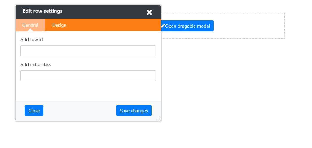
<button class="btn btn-primary" id="edit_row_btn">
<i class="fas fa-pencil-alt"></i>Open dragable modal
</button>
</div>
</div>
</div>
<!-- dragable and editable bootsttrap modal modal -->
<div class="modal fade" id="dragable_modal" tabindex="-1" role="dialog" aria-labelledby="myModalLabel2" data-backdrop="static" data-keyboard="false">
<div class="modal-dialog" role="document">
<div class="modal-content">
<div class="modal-header w-100">
<div class="row m-0 w-100">
<div class="col-md-12 px-4 p-2 dragable_touch d-block">
<h3 class="m-0 d-inline">Edit row settings</h3>
<button type="button" class="close close_btn" data-dismiss="modal" aria-label="Close" data-backdrop="static" data-keyboard="false"><i class="fa fa-times"></i></button>
</div>
<div class="col-md-12 p-0">
<ul class="nav nav-tabs custom_tab_on_editor" id="myTab" role="tablist">
<li class="nav-item" role="presentation">
<a class="nav-link active" id="home-tab" data-toggle="tab" href="#row_seetings_general_tab" role="tab" aria-controls="home" aria-selected="true">General</a>
</li>
<li class="nav-item" role="presentation">
<a class="nav-link" id="profile-tab" data-toggle="tab" href="#row_seetings_design_tab" role="tab" aria-controls="profile" aria-selected="false">Design</a>
</li>
</ul>
</div>
</div>
</div>
<div class="modal-body p-3">
<div class="tab-content" id="myTabContent">
<div class="tab-pane fade show active" id="row_seetings_general_tab" role="tabpanel" aria-labelledby="home-tab">
<div class="form-group">
<label for="edit_project_name">Add row id</label>
<input type="text" class="form-control" id="row_id" >
</div>
<div class="form-group">
<label for="edit_project_name">Add extra class</label>
<input type="text" class="form-control" id="edit_project_name" />
</div>
</div>
<div class="tab-pane fade" id="row_seetings_design_tab" role="tabpanel" aria-labelledby="profile-tab">...</div>
</div>
</div>
<div class="modal-footer bg-light">
<div class="row w-100">
<div class="col-6">
<button type="reset" class="btn btn-primary" data-dismiss="modal">Close</button>
</div>
<div class="col-6 text-right">
<button type="button" class="btn btn-primary">Save changes</button>
</div>
</div>
</div>
</div>
</div>
</div>
Jquery function to populate bootstrap modal and initializing the jquery Ui draggable function
Now I will create 3 function one is for opening bootstrap modal 2nd for fixing the initial position of bootstrap modal 3rd and final function is for initializing jquery UI draggable.
        $("#edit_row_btn").click(function () {
  //open modal
  $("#dragable_modal").modal({
    backdrop: false,
    show: true,
  });
  // reset modal if it isn't visible
  if (!$(".modal.in").length) {
    $(".modal-dialog").css({
      top: 20,
      left: 100,
    });
  }

  $(".modal-dialog").draggable({
    cursor: "move",
    handle: ".dragable_touch",
  });
});
Custom CSS for controlling the modal in a better way
Now I also write some custom CSS to design the bootstrap modal and make the modal body scrollable if minimize the modal window.
Note: here I am using
resize:both;
CSS properties for making modal resizable but this CSS property is browser dependent and does not support older browsers.
        .border_dot {
  border: 1px dashed #ccc;
}

#dragable_modal {
  position: relative;
}

#dragable_modal .modal-dialog {
  position: fixed;
  max-width: 100%;
  box-shadow: 0 0 5px rgba(0, 0, 0, 0.5);
  background: var(--white);
  /* width:500px; */
  margin: 0;
  /* padding: 20px; */
  /* overflow: hidden; */
  /* resize: both; */
}

#dragable_modal .modal-content {
  /* padding: 20px; */
  height: 400px;
  overflow: hidden;
  resize: both;
  width: 500px;
}

#dragable_modal .modal-body {
  height: relative;
  overflow-x: hidden;
  overflow-y: auto;
}
#dragable_modal .modal-header {
  background: var(--dark);
  color: var(--white);
  border-bottom: 0px;
  padding: 0px;
}
#dragable_modal .modal-header h3 {
  color: var(--white);
  font-size: 18px;
}
#dragable_modal .close_btn {
  top: -2px;
  margin: 0px !important;
  opacity: 1;
  width: 30px;
  height: 30px;
  padding: 0px;
  color: #fff;
}

.custom_tab_on_editor {
  background: var(--orange);
  padding: 0px;
  margin: 0px;
}

.custom_tab_on_editor .nav-item {
  margin-bottom: 0px;
}
.custom_tab_on_editor .nav-item .nav-link {
  min-width: 100px;
  text-align: center;
  border: 0px solid transparent;
  border-radius: 0px;
  padding: 10px;
  color: var(--white);
}

.custom_tab_on_editor .nav-item .nav-link:hover {
  color: #ffffff;
  border-width: 0px;
  background: #ffb586;
  border-bottom: 0px solid transparent;
}

.custom_tab_on_editor .nav-item.show .nav-link,
.custom_tab_on_editor .nav-link.active {
  color: #ffffff;
  border-width: 0px;
  background: #ffb586;
  border-bottom: 0px solid transparent;
  position: relative;
}
.dragable_touch {
  cursor: move;
}

.custom_tab_on_editor .nav-item.show .nav-link:before,
.custom_tab_on_editor .nav-link.active:before {
  content: "";
  border-bottom: 10px solid var(--white);
  border-left: 10px solid transparent;
  border-right: 10px solid transparent;
  position: absolute;
  bottom: 0px;
  left: 50%;
  transform: translateX(-50%);
}