Multiple owl-carousel sliders in one page
Hello, friends in this article we are going to cover the most important topic that is how to use multiple carousels or the owl-carousel sliders on a single page. the owl-carousel slider is a mostly usable plugin in a modern website. nowadays we are using a single website on multiple devices so for that we have to create our webpage full responsive and attractive.
Think about if you have multiple services or multiple product rows and you want to display on a single row in this case carousel slider is most useful.
Another example of an eCommerce web page. Even we see on the internet lots of eCommerce websites on our pc and also on our mobile or tablet device. so, in this case, we need to focus on product row in desktop view in one row we can see mostly 4 to 5 product but in a mobile device, we can only see one or two product in a single screen and other product is sliding one by one with more attractive.
In our previous tutorial, we had covered full customization of particle js
and now in this tutorial, we will solve the above example using the owl carousel.
Now, mostly I was suffering on the internet and see mostly tutorial is using id to control carousel. But my experience says that we should use a class instead of id to controlling carousel because If we will use class then we can repeat our carousel slider on a single page if all settings are same and products or service is different.
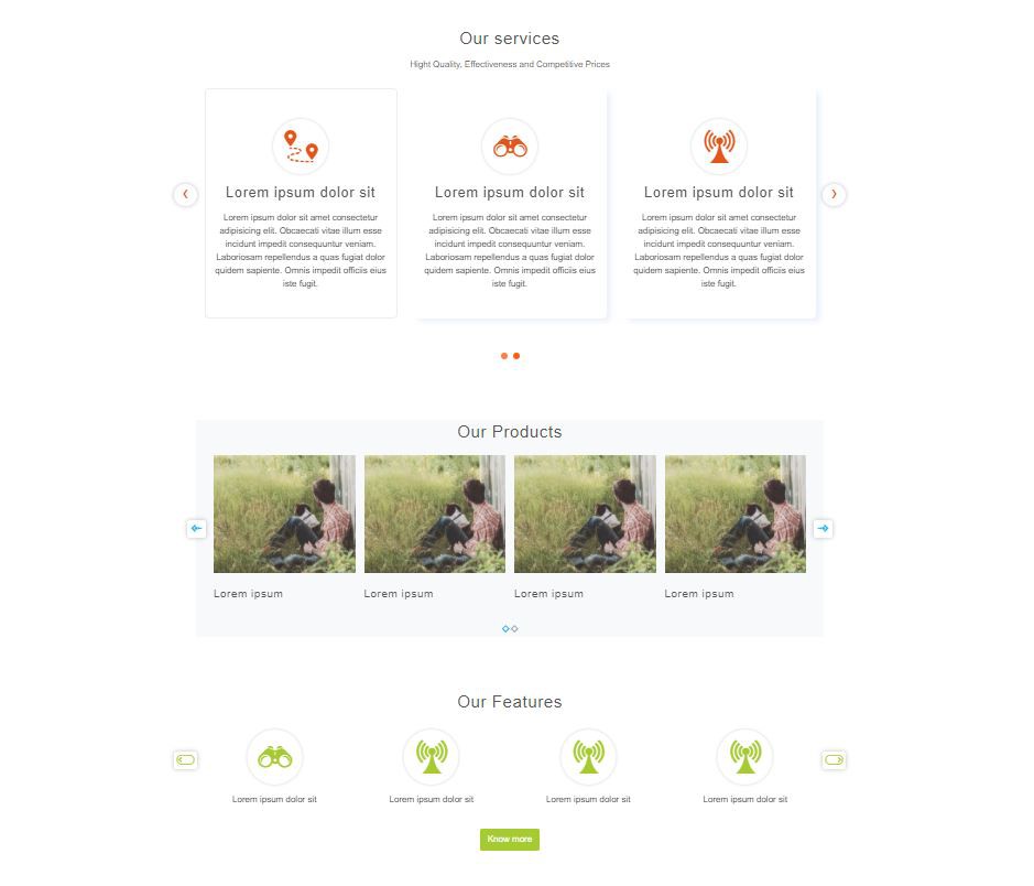
So let's have a look at a live example screenshot.
In the letter, we provide a live demo button so you can better understand
Furthermore, we will also discuss the order of the carousel. order in the sense slide from left to right or right to left
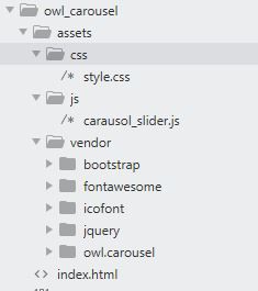
Let's have a look at the file structure, it is not more complicated you can just copy and paste them into your project. I hope it will work fine
Now we are going to create HTML file index.html
        <!-- Vendor CSS Files -->
<link href="assets/vendor/bootstrap/css/bootstrap.min.css" rel="stylesheet">
<link href="assets/vendor/fontawesome/css/all.min.css" rel="stylesheet">
<link href="assets/vendor/owl.carousel/assets/owl.carousel.min.css" rel="stylesheet">
<link href="assets/vendor/icofont/icofont.min.css" rel="stylesheet">
<link rel="stylesheet" type="text/css" href="assets/css/style.css">
<script src="assets/vendor/jquery/jquery.min.js"></script>

<section class="carousel_se_01">
  <div class="container-fluid px-0 py-5">
    <div class="container pt-5">
      <div class="row">
        <div class="col-md-12 px-0 pt-5" style="">
          <div class="col-sm-12 text-center">
            <h2>Our services</h2>
            <p class="m-0">Hight Quality, Effectiveness and Competitive Prices</p>
          </div>
          <div class="col-md-12 px-0 p-t-30">
            <div class="owl-carousel carousel_se_01_carousel owl-theme">
              <!-- 1 -->
              <div class="item">
                <div class="col-md-12 wow fadeInUp">
                  <div class="main_services text-center" style="">
                    <a href="#">
                      <div class="round_icon_img">
                        <i class="icofont-map-pins"></i>
                      </div>
                      <h3 class="mt-3">Lorem ipsum dolor sit</h3>
                      <p>
                        Lorem ipsum dolor sit amet consectetur adipisicing elit. Obcaecati vitae illum esse incidunt impedit consequuntur veniam. Laboriosam repellendus a quas fugiat dolor quidem sapiente. Omnis impedit officiis eius iste
                        fugit.
                      </p>
                    </a>
                  </div>
                </div>
              </div>

              <!-- 2 -->
              <div class="item">
                <div class="col-md-12 wow fadeInUp delay-2">
                  <div class="main_services text-center">
                    <a href="#">
                      <div class="round_icon_img">
                        <i class="icofont-binoculars"></i>
                      </div>
                      <h3 class="mt-3">Lorem ipsum dolor sit</h3>
                      <p>
                        Lorem ipsum dolor sit amet consectetur adipisicing elit. Obcaecati vitae illum esse incidunt impedit consequuntur veniam. Laboriosam repellendus a quas fugiat dolor quidem sapiente. Omnis impedit officiis eius iste
                        fugit.
                      </p>
                    </a>
                  </div>
                </div>
              </div>

              <!-- 3 -->
              <div class="item">
                <div class="col-md-12 wow fadeInUp delay-3">
                  <div class="main_services text-center">
                    <a href="#">
                      <div class="round_icon_img">
                        <i class="icofont-network-tower"></i>
                      </div>
                      <h3 class="mt-3">Lorem ipsum dolor sit</h3>
                      <p>
                        Lorem ipsum dolor sit amet consectetur adipisicing elit. Obcaecati vitae illum esse incidunt impedit consequuntur veniam. Laboriosam repellendus a quas fugiat dolor quidem sapiente. Omnis impedit officiis eius iste
                        fugit.
                      </p>
                    </a>
                  </div>
                </div>
              </div>

              <!-- 4-->
              <div class="item">
                <div class="col-md-12 wow fadeInUp delay-3">
                  <div class="main_services text-center">
                    <a href="#">
                      <div class="round_icon_img">
                        <i class="icofont-network-tower"></i>
                      </div>
                      <h3 class="mt-3">Lorem ipsum dolor sit</h3>
                      <p>
                        Lorem ipsum dolor sit amet consectetur adipisicing elit. Obcaecati vitae illum esse incidunt impedit consequuntur veniam. Laboriosam repellendus a quas fugiat dolor quidem sapiente. Omnis impedit officiis eius iste
                        fugit.
                      </p>
                    </a>
                  </div>
                </div>
              </div>
            </div>
          </div>
        </div>
      </div>
    </div>
  </div>
</section>

<section class="carousel_se_02">
  <div class="container-fluid py-5">
    <div class="container bg-light">
      <div class="row">
        <div class="col-sm-12 text-center wow fadeInUp">
          <h2>Our Products</h2>
        </div>
        <div class="col-md-12 px-4 pt-0">
          <div class="owl-carousel carousel_se_02_carousel owl-theme">
            <!-- 01 -->
            <div class="item">
              <div class="col-sm-12 p-2 wow fadeInUp delay-1">
                <div class="">
                  <div class="product-image3 hover15">
                    <img src="https://picsum.photos/id/1012/300/250" class="img-fluid pic-1" />
                  </div>
                  <h4 class="mt-3">Lorem ipsum</h4>
                </div>
              </div>
            </div>

            <!-- 2 -->
            <div class="item">
              <div class="col-sm-12 p-2 wow fadeInUp delay-3">
                <div class="">
                  <div class="product-image3 hover15">
                    <img src="https://picsum.photos/id/1012/300/250" class="img-fluid pic-1" />
                  </div>
                  <h4 class="mt-3">Lorem ipsum</h4>
                </div>
              </div>
            </div>

            <!-- 3 -->
            <div class="item">
              <div class="col-sm-12 p-2 wow fadeInUp delay-4">
                <div class="">
                  <div class="product-image3 hover15">
                    <img src="https://picsum.photos/id/1012/300/250" class="img-fluid pic-1" />
                  </div>
                  <h4 class="mt-3">Lorem ipsum</h4>
                </div>
              </div>
            </div>

            <!-- 4 -->
            <div class="item">
              <div class="col-sm-12 p-2 wow fadeInUp delay-2">
                <div class="">
                  <div class="product-image3 hover15">
                    <img src="https://picsum.photos/id/1012/300/250" class="img-fluid pic-1" />
                  </div>
                  <h4 class="mt-3">Lorem ipsum</h4>
                </div>
              </div>
            </div>

            <!-- 5 -->
            <div class="item">
              <div class="col-sm-12 p-2">
                <div class="">
                  <div class="product-image3 hover15">
                    <img src="https://picsum.photos/id/1012/300/250" class="img-fluid pic-1" />
                  </div>
                  <h4 class="mt-3">Lorem ipsum</h4>
                </div>
              </div>
            </div>

            <!-- 6 -->
            <div class="item">
              <div class="col-sm-12 p-2">
                <div class="">
                  <div class="product-image3 hover15">
                    <img src="https://picsum.photos/id/1012/300/250" class="img-fluid pic-1" />
                  </div>
                  <h4 class="mt-3">Lorem ipsum</h4>
                </div>
              </div>
            </div>
          </div>
        </div>
      </div>

      <!-- our clients -->
    </div>
  </div>
</section>

<section class="carousel_se_03">
  <div class="container-fluid px-0 py-5">
    <div class="container">
      <div class="row">
        <div class="col-md-12 px-0" style="">
          <div class="col-sm-12 text-center">
            <h2>Our Features</h2>
          </div>

          <div class="col-md-12 px-0 p-t-30">
            <div class="owl-carousel carousel_se_03_carousel owl-theme">
              <!--1 -->
              <div class="item">
                <div class="col-md-12 wow fadeInUp">
                  <div class="main_services text-center" style="">
                    <a href="#">
                      <div class="round_icon_img">
                        <i class="icofont-map-pins"></i>
                      </div>
                      <p class="mt-3">Lorem ipsum dolor sit</p>
                    </a>
                  </div>
                </div>
              </div>

              <!-- 2-->
              <div class="item">
                <div class="col-md-12 wow fadeInUp delay-2">
                  <div class="main_services text-center">
                    <a href="#">
                      <div class="round_icon_img">
                        <i class="icofont-binoculars"></i>
                      </div>
                      <p class="mt-3">Lorem ipsum dolor sit</p>
                    </a>
                  </div>
                </div>
              </div>

              <!-- 3 -->
              <div class="item">
                <div class="col-md-12 wow fadeInUp delay-3">
                  <div class="main_services text-center">
                    <a href="#">
                      <div class="round_icon_img">
                        <i class="icofont-network-tower"></i>
                      </div>
                      <p class="mt-3">Lorem ipsum dolor sit</p>
                    </a>
                  </div>
                </div>
              </div>

              <!-- 4 -->
              <div class="item">
                <div class="col-md-12 wow fadeInUp delay-3">
                  <div class="main_services text-center">
                    <a href="#">
                      <div class="round_icon_img">
                        <i class="icofont-network-tower"></i>
                      </div>
                      <p class="mt-3">Lorem ipsum dolor sit</p>
                    </a>
                  </div>
                </div>
              </div>
              <!-- 05 -->
              <div class="item">
                <div class="col-md-12 wow fadeInUp delay-3">
                  <div class="main_services text-center">
                    <a href="#">
                      <div class="round_icon_img">
                        <i class="icofont-network-tower"></i>
                      </div>
                      <p class="mt-3">Lorem ipsum dolor sit</p>
                    </a>
                  </div>
                </div>
              </div>
              <!-- 06 -->
              <div class="item">
                <div class="col-md-12 wow fadeInUp delay-3">
                  <div class="main_services text-center">
                    <a href="#">
                      <div class="round_icon_img">
                        <i class="icofont-network-tower"></i>
                      </div>
                      <p class="mt-3">Lorem ipsum dolor sit</p>
                    </a>
                  </div>
                </div>
              </div>
            </div>
          </div>
        </div>

        <div class="col-md-12 px-0 p-t-30 text-center pt-4">
          <a href="#" class="btn btn-primary">Know more</a>
        </div>
      </div>
    </div>
  </div>
</section>
Now create style.css
        /*common style*/

@import url("https://fonts.googleapis.com/css2?family=Montserrat:ital,wght@0,100;0,200;0,300;0,400;0,500;0,600;0,700;1,100;1,200;1,300;1,400;1,500;1,600&family=Rajdhani:wght@300;400;600;700&display=swap");

body {
  color: #555555;
  font-family: "Montserrat", sans-serif;
}
html {
  scroll-behavior: smooth;
}

a {
  text-decoration: none;
  color: #232323;
}

a:hover {
  text-decoration: none;
  color: #232323;
}

h1,
h2,
h3,
h4,
h5,
h6 {
  margin: 0px 0px 15px 0px;
  color: #555555;
  font-family: "Montserrat", sans-serif;
}

h1 {
  font-size: 36px;
}

h2 {
  font-size: 30px;
  line-height: 42px;
  margin-bottom: 15px;
  letter-spacing: 1.2px;
  font-weight: 400;
}

h3 {
  font-size: 26px;
  line-height: 36px;
  letter-spacing: 1.1px;
  font-weight: 400;
}
h4 {
  font-size: 20px;
  line-height: 26px;
  letter-spacing: 1px;
  font-weight: 400;
}
.icons_cont {
  text-align: center;
}

.round_icon_img {
  border-radius: 50%;
  box-shadow: 0 0 6px rgba(0, 0, 0, 0.25);
  background: #fff;
  width: 100px !important;
  height: 100px;
  padding: 16px;
  margin: 15px auto !important;
}

.round_icon_img i {
  font-size: 70px;
  color: #e0571d;
}

/* Circle */
.hover15 {
  position: relative;
  width: 100%;
  height: auto;
  padding: 0px !important;
  overflow: hidden;
}

.hover15::before {
  position: absolute;
  top: 50%;
  left: 50%;
  z-index: 2;
  display: block;
  content: "";
  width: 0;
  height: 0;
  background: rgba(244, 229, 172, 0.4);
  border-radius: 100%;
  -webkit-transform: translate(-50%, -50%);
  transform: translate(-50%, -50%);
  opacity: 0;
}
.hover15:hover::before {
  -webkit-animation: circle 0.75s;
  animation: circle 0.75s;
}
.hover15 img {
  transition: all 0.3s;
}
.hover15:hover img {
  transform: scale(1.2);
}
@-webkit-keyframes circle {
  0% {
    opacity: 1;
  }
  40% {
    opacity: 1;
  }
  100% {
    width: 200%;
    height: 200%;
    opacity: 0;
  }
}
@keyframes circle {
  0% {
    opacity: 1;
  }
  40% {
    opacity: 1;
  }
  100% {
    width: 200%;
    height: 200%;
    opacity: 0;
  }
}

.owl-carousel .owl-nav .owl-prev:focus,
.owl-carousel .owl-nav .owl-next:focus {
  outline: none;
}

.owl-carousel .owl-nav button.owl-next,
.owl-carousel .owl-nav button.owl-prev,
.owl-carousel button.owl-dot {
  outline: none;
}

/*common styling end*/

/*------/ Owl carousel /------*/
/* carousel_se_01 */
.carousel_se_01 .owl-theme .owl-dots {
  text-align: center;
  margin-top: 18px;
}

.carousel_se_01 .owl-theme .owl-dots .owl-dot {
  display: inline-block;
}

.carousel_se_01 .owl-theme .owl-dots .owl-dot span {
  width: 12px;
  height: 12px;
  margin: 5px 5px;
  background: #ff5e14;
  border: 0px solid #ff5e14;
  display: block;
  transition: all 0.6s ease-in-out;
  cursor: pointer;
  border-radius: 50%;
}

.carousel_se_01 .owl-theme .owl-dots .owl-dot:hover span {
  color: #fff;
  background: #ff5e14;
  /*  border: 5px double;*/
  padding: 5px;
  border-radius: 50%;
}

.carousel_se_01 .owl-theme .owl-dots .owl-dot.active span {
  color: #fff;
  background: #ff5e14;
  /* border: 5px double;*/
  opacity: 0.8;
  padding: 5px;
  border-radius: 50%;
  background: #ff5e14;
}

.carousel_se_01 .owl-carousel .owl-nav button.owl-next {
  position: absolute;
  top: 42%;
  right: -40px;
  padding: 0px 15px 6px 15px !important;
  background: rgb(255, 255, 255);
  display: inline-block;
  transform: translateY(-50%);
  border-radius: 50%;
  font-size: 35px;
  line-height: 35px;
  color: #e0571d;
  box-shadow: 0 0 8px rgba(0, 0, 0, 0.25);
}
.carousel_se_01 .owl-carousel .owl-nav button.owl-next:hover {
  background: #ff5e14;
  color: #fff;
}
.carousel_se_01 .owl-carousel .owl-nav button.owl-prev {
  position: absolute;
  top: 42%;
  left: -40px;
  padding: 0px 15px 6px 15px !important;
  background: rgb(255, 255, 255);
  display: inline-block;
  transform: translateY(-50%);
  border-radius: 50%;
  font-size: 35px;
  line-height: 35px;
  color: #e0571d;
  box-shadow: 0 0 8px rgba(0, 0, 0, 0.25);
}
.carousel_se_01 .owl-carousel .owl-nav button.owl-prev:hover {
  background: #ff5e14;
  color: #fff;
}

.carousel_se_01 .owl-arrow .owl-nav {
  position: absolute;
  top: 0;
  right: 0;
  font-size: 1.8rem;
}

.carousel_se_01 .owl-arrow .owl-nav .owl-prev,
.carousel_se_01 .owl-arrow .owl-nav .owl-next {
  display: inline-block;
  transition: all 0.6s ease-in-out;
  color: #000000;
}

.carousel_se_01 .main_services {
  position: relative;
  margin: 30px 0px 40px 0px;
  padding: 40px 15px 32px 15px;
  overflow: hidden;
  text-align: center;
  border: 1px solid transparent;
  border-radius: 8px 8px;
  /* box-shadow: 12px 14px 0 #ececec; */
  box-shadow: 7px 7px 10px 0 rgba(76, 110, 245, 0.1);
  min-height: 348px;
}

.carousel_se_01 .main_services:hover {
  border: 1px solid #ededed;
  box-shadow: none;
}

/*// sec 01 end*/

/*carousel_se_02 start*/
.carousel_se_02 {
  overflow: hidden;
}

.carousel_se_02 .product-grid3 {
  border: none;
  box-shadow: none;
}

.carousel_se_02 .owl-theme .owl-dots {
  text-align: center;
  margin-top: 18px;
}

.carousel_se_02 .owl-theme .owl-dots .owl-dot {
  display: inline-block;
}

.carousel_se_02 .owl-theme .owl-dots .owl-dot span {
  width: 9px;
  height: 9px;
  margin: 4px;
  border: 2px solid #94a5b4;
  display: block;
  -webkit-backface-visibility: visible;
  -webkit-transition: opacity 200ms ease;
  -moz-transition: opacity 200ms ease;
  -ms-transition: opacity 200ms ease;
  -o-transition: opacity 200ms ease;
  transition: opacity 200ms ease;
  -webkit-transform: rotate(45deg);
  -ms-transform: rotate(45deg);
  transform: rotate(45deg);
}

.carousel_se_02 .owl-theme .owl-dots .owl-dot:hover span {
  border-color: #2bb0ef;
}

.carousel_se_02 .owl-theme .owl-dots .owl-dot.active span {
  border-color: #2bb0ef;
}

.carousel_se_02 .owl-carousel .owl-nav button.owl-next {
  position: absolute;
  top: 42%;
  right: -40px;
  padding: 0px 1px !important;
  background: rgb(255, 255, 255);
  display: inline-block;
  transform: translateY(-50%);
  border-radius: 5px;
  font-size: 32px;
  line-height: 32px;
  color: #2bb0ef;
  box-shadow: 0 0 8px rgba(0, 0, 0, 0.25);
}
.carousel_se_02 .owl-carousel .owl-nav button.owl-next:hover {
  background: #2bb0ef;
  color: #fff;
}
.carousel_se_02 .owl-carousel .owl-nav button.owl-prev {
  position: absolute;
  top: 42%;
  left: -40px;
  padding: 0px 1px !important;
  background: rgb(255, 255, 255);
  display: inline-block;
  transform: translateY(-50%);
  border-radius: 5px;
  font-size: 32px;
  line-height: 32px;
  color: #2bb0ef;
  box-shadow: 0 0 8px rgba(0, 0, 0, 0.25);
}
.carousel_se_02 .owl-carousel .owl-nav button.owl-prev:hover {
  background: #2bb0ef;
  color: #fff;
}
.carousel_se_02 .owl-arrow .owl-nav {
  position: absolute;
  top: 0;
  right: 0;
  font-size: 1.8rem;
}

.carousel_se_02 .owl-arrow .owl-nav .owl-prev,
.carousel_se_02 .owl-arrow .owl-nav .owl-next {
  display: inline-block;
  transition: all 0.6s ease-in-out;
  color: #000000;
}
/* //carousel_se_02 end*/

/*carousel_se_02 start*/
.carousel_se_03 {
  overflow: hidden;
}

.carousel_se_03 .product-grid3 {
  border: none;
  box-shadow: none;
}

.carousel_se_03 .owl-carousel .owl-nav button.owl-next {
  position: absolute;
  top: 42%;
  right: -40px;
  padding: 0px 5px !important;
  background: rgb(255, 255, 255);
  display: inline-block;
  transform: translateY(-50%);
  border-radius: 5px;
  font-size: 32px;
  line-height: 32px;
  color: #a5ca34;
  box-shadow: 0 0 8px rgba(0, 0, 0, 0.25);
}
.carousel_se_03 .owl-carousel .owl-nav button.owl-next:hover {
  background: #a5ca34;
  color: #fff;
}
.carousel_se_03 .owl-carousel .owl-nav button.owl-prev {
  position: absolute;
  top: 42%;
  left: -40px;
  padding: 0px 5px !important;
  background: rgb(255, 255, 255);
  display: inline-block;
  transform: translateY(-50%);
  border-radius: 5px;
  font-size: 32px;
  line-height: 32px;
  color: #a5ca34;
  box-shadow: 0 0 8px rgba(0, 0, 0, 0.25);
}
.carousel_se_03 .owl-carousel .owl-nav button.owl-prev:hover {
  background: #a5ca34;
  color: #fff;
}
.carousel_se_03 .owl-arrow .owl-nav {
  position: absolute;
  top: 0;
  right: 0;
  font-size: 1.8rem;
}

.carousel_se_03 .owl-arrow .owl-nav .owl-prev,
.carousel_se_03 .owl-arrow .owl-nav .owl-next {
  display: inline-block;
  transition: all 0.6s ease-in-out;
  color: #a5ca34;
}

.carousel_se_03 .round_icon_img i {
  font-size: 70px;
  color: #a5ca34;
}

.carousel_se_03 .btn-primary {
  background: #a5ca34;
  border-color: #a5ca34;
}

.carousel_se_03 .btn-primary:hover,
.carousel_se_03 .btn-primary:focus,
.carousel_se_03 .btn-primary:active {
  background: #708e15;
}
/* //carousel_se_02 end*/

/*media query start */

/*less than 575px*/
@media only screen and (max-width: 380px) {
}

/*less than 575px*/
@media only screen and (max-width: 575px) and (min-width: 380px) {
}

/*less than 767px*/
@media only screen and (max-width: 768px) and (min-width: 575px) {
}
/*less then 992px and less than 768*/
@media only screen and (max-width: 993px) and (min-width: 768px) {
}

/*less then1140px and less than 993*/
@media only screen and (max-width: 1140px) and (min-width: 993px) {
}

@media only screen and (max-width: 1366px) and (min-width: 1141px) {
}
The carousel order default setting is from right to left for the ing opposite of this just use direction:rtl
Now we need to treat the carousel setting js file
in this ,file we will see different setting the of carousel
carausol_slider.js
        /*scrolling banner*/
(function ($) {
  "use strict";

  $(document).ready(function () {
    $(".carousel_se_01_carousel").owlCarousel({
      items: 3,
      nav: true,
      loop: true,

      mouseDrag: true,
      responsiveClass: true,
      /*navText : ["<i class='fas fa-long-arrow-alt-left'></i>","<i class='fas fa-long-arrow-alt-right'></i>"],*/
      responsive: {
        0: {
          items: 1,
        },
        480: {
          items: 1,
        },
        767: {
          items: 2,
        },
        992: {
          items: 3,
        },
        1200: {
          items: 3,
        },
      },
    });
  });

  $(document).ready(function () {
    $(".carousel_se_02_carousel").owlCarousel({
      items: 4,
      nav: true,
      loop: true,

      mouseDrag: true,
      responsiveClass: true,
      navText: ["<i class='icofont-bubble-left'></i>", "<i class='icofont-bubble-right'></i>"],
      responsive: {
        0: {
          items: 1,
        },
        480: {
          items: 2,
        },
        767: {
          items: 3,
        },
        992: {
          items: 3,
        },
        1200: {
          items: 4,
        },
      },
    });
  });

  $(document).ready(function () {
    $(".carousel_se_03_carousel").owlCarousel({
      items: 4,
      nav: true,
      dots: false,
      loop: true,

      mouseDrag: true,
      responsiveClass: true,
      autoplay: true,
      autoplayTimeout: 3000,
      autoplayHoverPause: true,
      navText: ["<i class='icofont-scroll-left'></i>", "<i class='icofont-scroll-right'></i>"],
      responsive: {
        0: {
          items: 1,
        },
        480: {
          items: 2,
        },
        767: {
          items: 3,
        },
        992: {
          items: 3,
        },
        1200: {
          items: 4,
        },
      },
    });
  });
})(jQuery);