Bootstrap navbar animating from the left side using CSS
In our previous tutorial, we have seen animating bootstrap 4 modal making them sliding either from left or right side of the screen. In this tutorial, we are going to create a a fully responsive Bootstrap navbar. Specially, we will focus on improving the mobile view by implementing a stylish slide-in animation using some custom CSS. This tutorial will cover everything from setting up the necessary HTML and CSS to implementing slide-in effect.
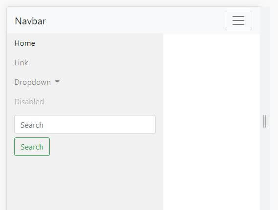
As we know by default bootstrap navigation appears from the top in the mobile view, in this tutorial we will create it from the left side in the mobile view only using a few lines of CSS code.
So, Let's start, just copy the below HTML code and paste it in your navigation section
        <!DOCTYPE html>
<html lang="en">

<head>
  <meta charset="UTF-8">
  <meta http-equiv="X-UA-Compatible" content="IE=edge">
  <meta name="viewport" content="width=device-width, initial-scale=1.0">
  <title>Bootstrap navigation from left in mobile view</title>
  <!-- Bootstrap CSS -->
  <link rel="stylesheet" href="https://stackpath.bootstrapcdn.com/bootstrap/4.3.1/css/bootstrap.min.css"
    integrity="sha384-ggOyR0iXCbMQv3Xipma34MD+dH/1fQ784/j6cY/iJTQUOhcWr7x9JvoRxT2MZw1T" crossorigin="anonymous">

  <script src="https://code.jquery.com/jquery-3.3.1.slim.min.js"
    integrity="sha384-q8i/X+965DzO0rT7abK41JStQIAqVgRVzpbzo5smXKp4YfRvH+8abtTE1Pi6jizo"
    crossorigin="anonymous"></script>

  <script src="" integrity="sha384-UO2eT0CpHqdSJQ6hJty5KVphtPhzWj9WO1clHTMGa3JDZwrnQq4sF86dIHNDz0W1"
    crossorigin="anonymous"></script>
  <script src="https://stackpath.bootstrapcdn.com/bootstrap/4.3.1/js/bootstrap.min.js"
    integrity="sha384-JjSmVgyd0p3pXB1rRibZUAYoIIy6OrQ6VrjIEaFf/nJGzIxFDsf4x0xIM+B07jRM"
    crossorigin="anonymous"></script>

</head>

<body>

  <nav class="navbar navbar-expand-lg navbar-light bg-light fixed-top">
    <a class="navbar-brand" href="#">Navbar</a>
    <button class="navbar-toggler" type="button" data-toggle="collapse" data-target="#navbarSupportedContent"
      aria-controls="navbarSupportedContent" aria-expanded="false" aria-label="Toggle navigation">
      <span class="navbar-toggler-icon"></span>
    </button>

    <div class="collapse navbar-collapse" id="navbarSupportedContent">
      <ul class="navbar-nav mr-auto">
        <li class="nav-item active">
          <a class="nav-link" href="#">Home <span class="sr-only">(current)</span></a>
        </li>
        <li class="nav-item">
          <a class="nav-link" href="#">Link</a>
        </li>
        <li class="nav-item dropdown">
          <a class="nav-link dropdown-toggle" href="#" id="navbarDropdown" role="button" data-toggle="dropdown"
            aria-haspopup="true" aria-expanded="false">
            Dropdown
          </a>
          <div class="dropdown-menu" aria-labelledby="navbarDropdown">
            <a class="dropdown-item" href="#">Action</a>
            <a class="dropdown-item" href="#">Another action</a>
            <div class="dropdown-divider"></div>
            <a class="dropdown-item" href="#">Something else here</a>
          </div>
        </li>
        <li class="nav-item">
          <a class="nav-link disabled" href="#" tabindex="-1" aria-disabled="true">Disabled</a>
        </li>
      </ul>
      <form class="form-inline my-2 my-lg-0">
        <input class="form-control mr-sm-2" type="search" placeholder="Search" aria-label="Search">
        <button class="btn btn-outline-success my-2 my-sm-0" type="submit">Search</button>
      </form>
    </div>
  </nav>

  <div class="container pt-5">
    <div class="row">
      <div class="col-md-12 pt-4">
        <h2>Just open in mobile view and click on the menu button and see the effect
        </h2>

      </div>
    </div>
  </div>

  <div class="container pt-2">
    <div class="row">
      <div class="col-md-12 pt-4">
        <script async
          src="https://pagead2.googlesyndication.com/pagead/js/adsbygoogle.js?client=ca-pub-1190033123418031"
          crossorigin="anonymous"></script>
        <!-- live_demo_page -->
        <ins class="adsbygoogle" style="display:block" data-ad-client="ca-pub-1190033123418031"
          data-ad-slot="5335471635" data-ad-format="auto" data-full-width-responsive="true"></ins>
        <script>
          (adsbygoogle = window.adsbygoogle || []).push({});
        </script>
      </div>
    </div>
  </div>

  <div style="padding-top: 900px;"></div>
</body>

</html>
Mobile menu sliding from right side of the:
If ou want to open the mobile meny by sliding from the right side instead of left you just have to repleace the previouss provided CSS by below CSS.
        @media (max-width: 991px) {
      .navbar-collapse {
        position: fixed;
        top: 54px;
        right: 0;
        padding-left: 15px;
        padding-right: 15px;
        padding-bottom: 15px;
        width: 100%;
        background:
          #f1f1f1;
        max-width: 320px;
        height: 100vh;
        overflow-y: auto;
      }

      .navbar-collapse.collapsing {
        height: 100%;
        -webkit-transition: right 0.3s ease;
        -o-transition: right 0.3s ease;
        -moz-transition: right 0.3s ease;
        transition: right 0.3s ease;
        right: -100%;
      }

      .navbar-collapse.show {
        right: 0;
        -webkit-transition: right 0.3s ease-in;
        -o-transition: right 0.3s ease-in;
        -moz-transition: right 0.3s ease-in;
        transition: right 0.3s ease-in;
      }
    }


        @media (max-width: 991px) {
        .navbar-collapse {
          position: fixed;
          top: 54px;
          left: 0;
          padding-left: 15px;
          padding-right: 15px;
          padding-bottom: 15px;
          width: 100%;
          background:
            #f1f1f1;
          max-width: 320px;
          height: 100vh;
          overflow-y: auto;
        }

        .navbar-collapse.collapsing {
          height: 100%;
          -webkit-transition: left 0.3s ease;
          -o-transition: left 0.3s ease;
          -moz-transition: left 0.3s ease;
          transition: left 0.3s ease;
          left: -100%;
        }

        .navbar-collapse.show {
          left: 0;
          -webkit-transition: left 0.3s ease-in;
          -o-transition: left 0.3s ease-in;
          -moz-transition: left 0.3s ease-in;
          transition: left 0.3s ease-in;
        }
      }